Princeton University
Visual Arts Program
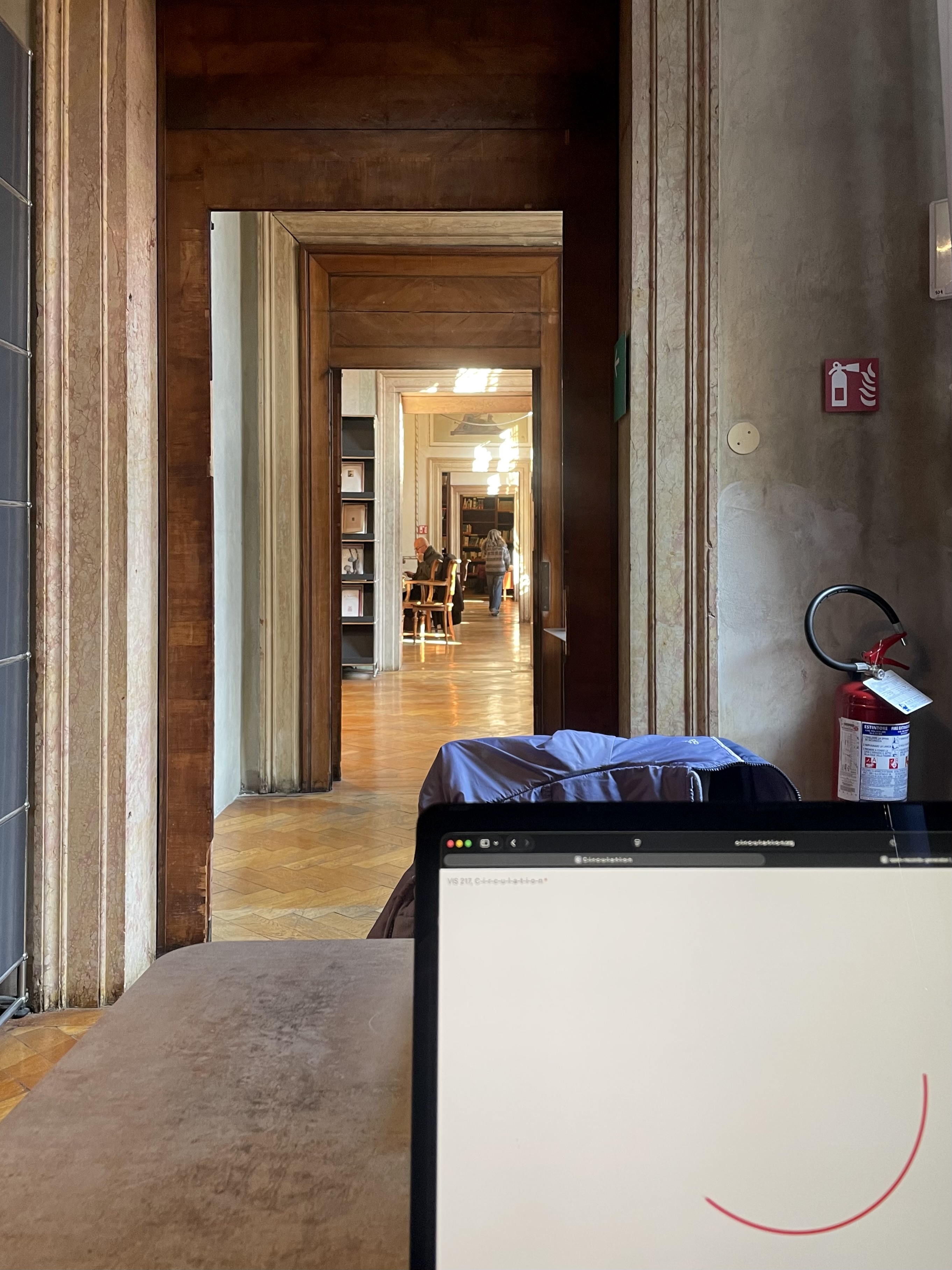
VIS 217, C-i-r-c-u-l-a-t-i-o-n
Tuesdays, 1:30–4:20 pm
Spring 2026
The practice of graphic design relies on the existence of networks for distributing multiple copies of identical things. Students in this course will consider the ways in which a graphic design object’s characteristics are affected by its ability to be copied and shared, and by the environment in which it is intended to circulate. Through hands-on design projects, readings, and discussions, students will delve into different material forms of distribution — the printed newspaper, social network software, the community radio station, the PDF.
http://c-i-r-c-u-l-a-t-i-o-n.org
Print syllabus / Download readings
January 27, 2026
The Information
Readings
The-Information.pdf (James Gleick)
Resources
Designing-a-Book-Cover-for-Italo-Calvino.pdf (Interview with Peter Mendelsund)
Ada, Countess of Lovelace iBooks sample
A-Mathematical-Theory-of-Communication.pdf
Bobby C. Martin, Jr. and Abyssinian Baptist Church
Peter Mendelsund, Cover and What We See When We Read
Assignment
#1 The Information
Popular science writer James Gleick recently published a book titled simply, The Information. Perhaps you’ve seen it? Maybe even read it, all 526 pages worth? I haven’t. But, I *was* instantly aware of it when it was published in March 2011 through book reviews like this one by Geoffrey Nunberg in The New York Times. You might notice that the review published March 18 in print is concluded by a correction added April 3 on the website:
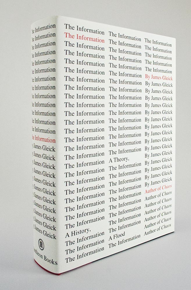
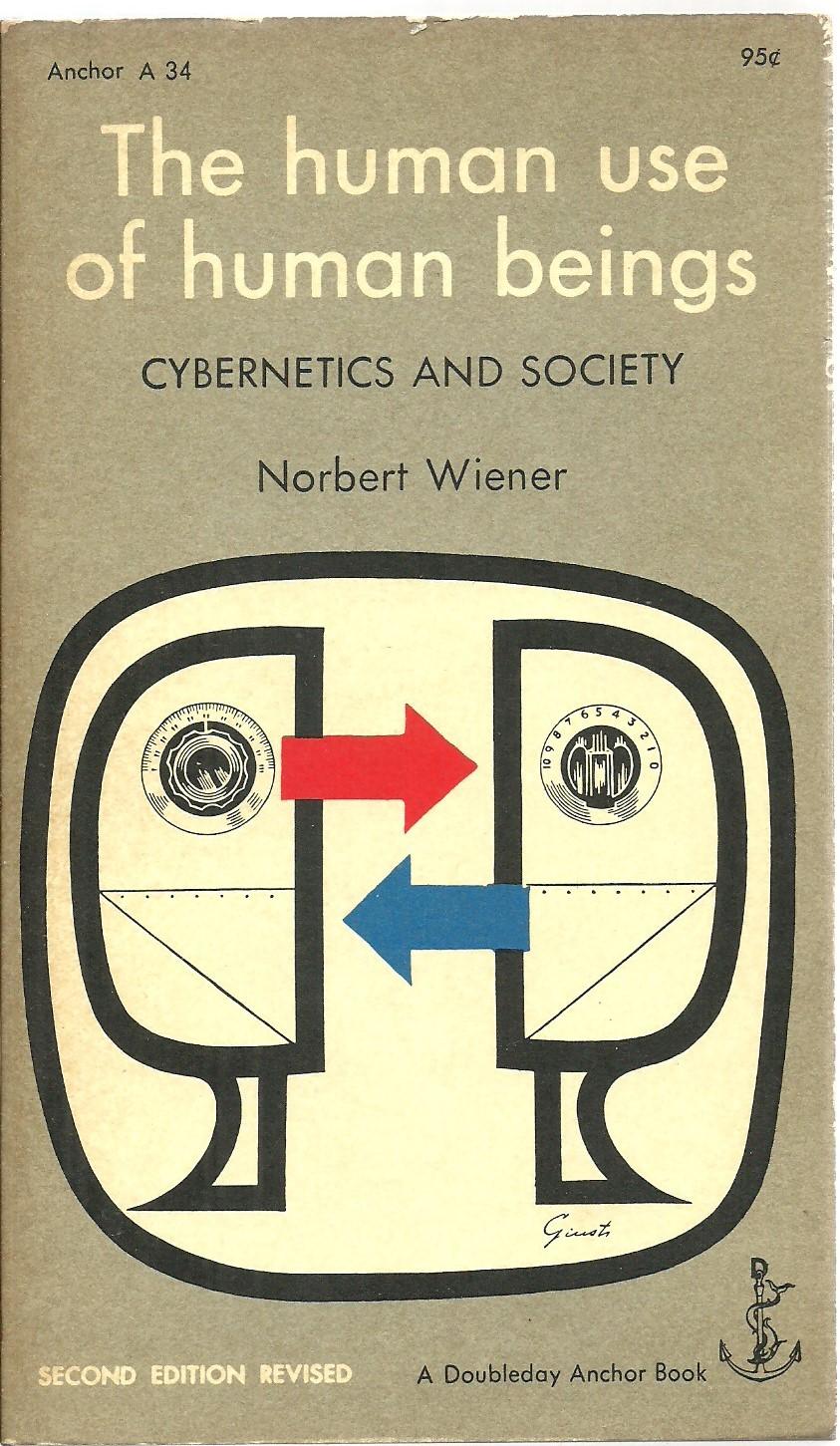
Meanwhile, I caught glancing references to The Information in other magazines, on the radio, through websites, in conversation. The book’s subject matter, so far as I gleaned from these secondary sources, is information theory and includes the essentially-related subtopics of entropy, publication, computer networks, semantic chains, bits, encoding, and communication at large. Its constellation of references includes Ada Lovelace, Alan Turing’s universal computer, Kurt Gödel, Claude Shannon, Bell Labs, Norbert Wiener, cybernetics, MIT, logical recursion, and so on and so on.
All of this seemed way too close to my own interests; I was almost afraid to read it. (I’ve no idea if you can relate to this impulse, but I was worried that my thinking might be spoiled by reading someone else’s synthesis of this material.) It was as if a more accomplished thinker and writer had opened the most active corners of my brain, mined the pertinent subjects, and ghosted it into a comprehensive and cohesive commercially available non-fiction hardback.
Several close friends showed no such reticence and began reading it immediately on publication. I soon heard accounts of how wonderful the book is. They might drop a nugget, a chapter title, or just offer a generalized effusive blessing. I resolved to read it myself once it came out in paperback. This bought me some time and anyway, I hate the unwieldiness of trade hardcover books with that many pages. Surely the paperback would be a bit more manageable — I could carry it on the subway, take it on a trip, curl up with it in bed.
One friend in particular was becoming increasingly emphatic, insisting I must read the book now. In June, he scanned Chapter 14, “After the Flood (A Great Album of Babel),” made a PDF and emailed it to me. He suggested I read only this chapter now (it is around Wikipedia and the endgame of libraries in the face of the ultimate archive known as the internet), as a preview or trailer for the rest of the book. So I read it. How could I not after such an effort? It *was* fantastic and my anticipation for the whole book was further stoked by this recommendation.
By August that year, my brother-in-law toted the brick-of-a-book up on vacation to Vermont because he thought I’d enjoy it. Well, yes, I probably would, but not yet.
Continues in class . . .
A review on March 20 about The Information, James Gleick’s history of data organization, misstated the surname of the founder of cybernetics. He was Norbert Wiener, not Weiner.”I, however, read it on paper, complete with the error.
Meanwhile, I caught glancing references to The Information in other magazines, on the radio, through websites, in conversation. The book’s subject matter, so far as I gleaned from these secondary sources, is information theory and includes the essentially-related subtopics of entropy, publication, computer networks, semantic chains, bits, encoding, and communication at large. Its constellation of references includes Ada Lovelace, Alan Turing’s universal computer, Kurt Gödel, Claude Shannon, Bell Labs, Norbert Wiener, cybernetics, MIT, logical recursion, and so on and so on.
All of this seemed way too close to my own interests; I was almost afraid to read it. (I’ve no idea if you can relate to this impulse, but I was worried that my thinking might be spoiled by reading someone else’s synthesis of this material.) It was as if a more accomplished thinker and writer had opened the most active corners of my brain, mined the pertinent subjects, and ghosted it into a comprehensive and cohesive commercially available non-fiction hardback.
Several close friends showed no such reticence and began reading it immediately on publication. I soon heard accounts of how wonderful the book is. They might drop a nugget, a chapter title, or just offer a generalized effusive blessing. I resolved to read it myself once it came out in paperback. This bought me some time and anyway, I hate the unwieldiness of trade hardcover books with that many pages. Surely the paperback would be a bit more manageable — I could carry it on the subway, take it on a trip, curl up with it in bed.
One friend in particular was becoming increasingly emphatic, insisting I must read the book now. In June, he scanned Chapter 14, “After the Flood (A Great Album of Babel),” made a PDF and emailed it to me. He suggested I read only this chapter now (it is around Wikipedia and the endgame of libraries in the face of the ultimate archive known as the internet), as a preview or trailer for the rest of the book. So I read it. How could I not after such an effort? It *was* fantastic and my anticipation for the whole book was further stoked by this recommendation.
By August that year, my brother-in-law toted the brick-of-a-book up on vacation to Vermont because he thought I’d enjoy it. Well, yes, I probably would, but not yet.
Continues in class . . .
February 10, 2026
How do you see the Internet?
Resources
Walking the Internet: Princeton
Networks-of-New-York.pdf (Ingrid Burrington)
Exercise
A walking tour of the internet
How do you see the Internet?
Resources
Walking the Internet: Princeton
Networks-of-New-York.pdf (Ingrid Burrington)
Exercise
A walking tour of the internet
How do you see the Internet? Ingrid Burrington writes,
Which network? It depends on where you are. Here in our classroom, this starts with the Eduroam wifi where this computer is currently wirelessly connected via radio waves. The next hop might be a wifi router that is sending out these signals. That router is connected to another router, which connected to another, and so on and so on. But where physically are these routers? Where are the cables that connect them and what happens next?
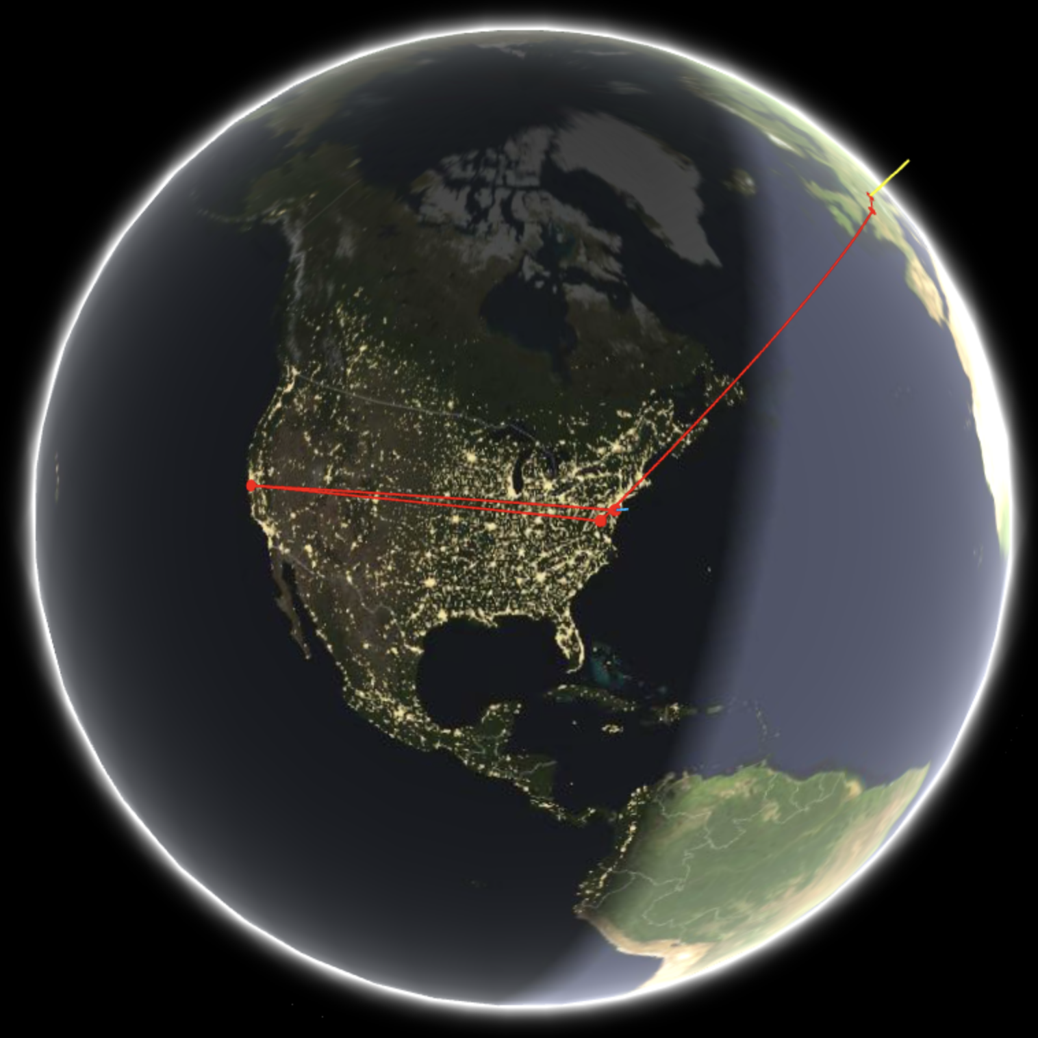
There is a pretty amazing website which clarifies some of this — geotraceroute.com shows the geographic locations of all the servers (and routers) that a particular web requests bounces around between en route to answering the website request. Here’s the path that my request to princeton.edu from where I am sitting right now (Fondazione Querini Stampalia, Venice, Italy):
Let’s move on to the second question: "How do you think the Internet works?
We are going to go for a walk together now and see what we can see.
Continues in class ...
Over the past two years, I've asked a lot of people this question. It's a question often met with confusion or requests for clarification. Do I mean "What do you think about the Internet, like in the grand scheme of things?" or "How do you think the Internet works?" or "How do you access the Internet?" Really, I'm asking all three.She suggests we take the last question first: How do you access the internet? Well, on a computer, sure, or more commonly your phone. But what happens when you load a website? It all starts with a request to a network.
Which network? It depends on where you are. Here in our classroom, this starts with the Eduroam wifi where this computer is currently wirelessly connected via radio waves. The next hop might be a wifi router that is sending out these signals. That router is connected to another router, which connected to another, and so on and so on. But where physically are these routers? Where are the cables that connect them and what happens next?
There is a pretty amazing website which clarifies some of this — geotraceroute.com shows the geographic locations of all the servers (and routers) that a particular web requests bounces around between en route to answering the website request. Here’s the path that my request to princeton.edu from where I am sitting right now (Fondazione Querini Stampalia, Venice, Italy):
Let’s move on to the second question: "How do you think the Internet works?
“I have no idea, maybe black magic.”That’s fair. But a little information can illuminate an answer that is surprisingly concrete. Every internet request that comes from our classroom travels over a cable buried underneath Nassau Street, just outside the window
We are going to go for a walk together now and see what we can see.
Continues in class ...
February 17, 2026
“We have no art, we do everything as well as we can.”
Reading
Lift and separate : graphic design and the quote vernacular unquote (editor Barbara Glauber)
Resources
We Have No Art
Power Up: The Work of Sister Corita with Barbara Glauber
the-copy.com
Assignment
#2 We have no art ...
“We have no art, we do everything as well as we can.”
Reading
Lift and separate : graphic design and the quote vernacular unquote (editor Barbara Glauber)
Resources
We Have No Art
Power Up: The Work of Sister Corita with Barbara Glauber
the-copy.com
Assignment
#2 We have no art ...
It seems to be a Balinese saying which Sister Corita Kent borrowed to describe what she was up to with her art classes at Immaculate Heart College for about 30 years:
Corita Kent was also already the subject of a 1967 documentary by Baylis Glascock, ”We Have No Art.” This film catches Kent at her lucid, modest, powerful best in the act of teaching. We are going to watch some choice excerpts from a 30-minute excerpt posted online.
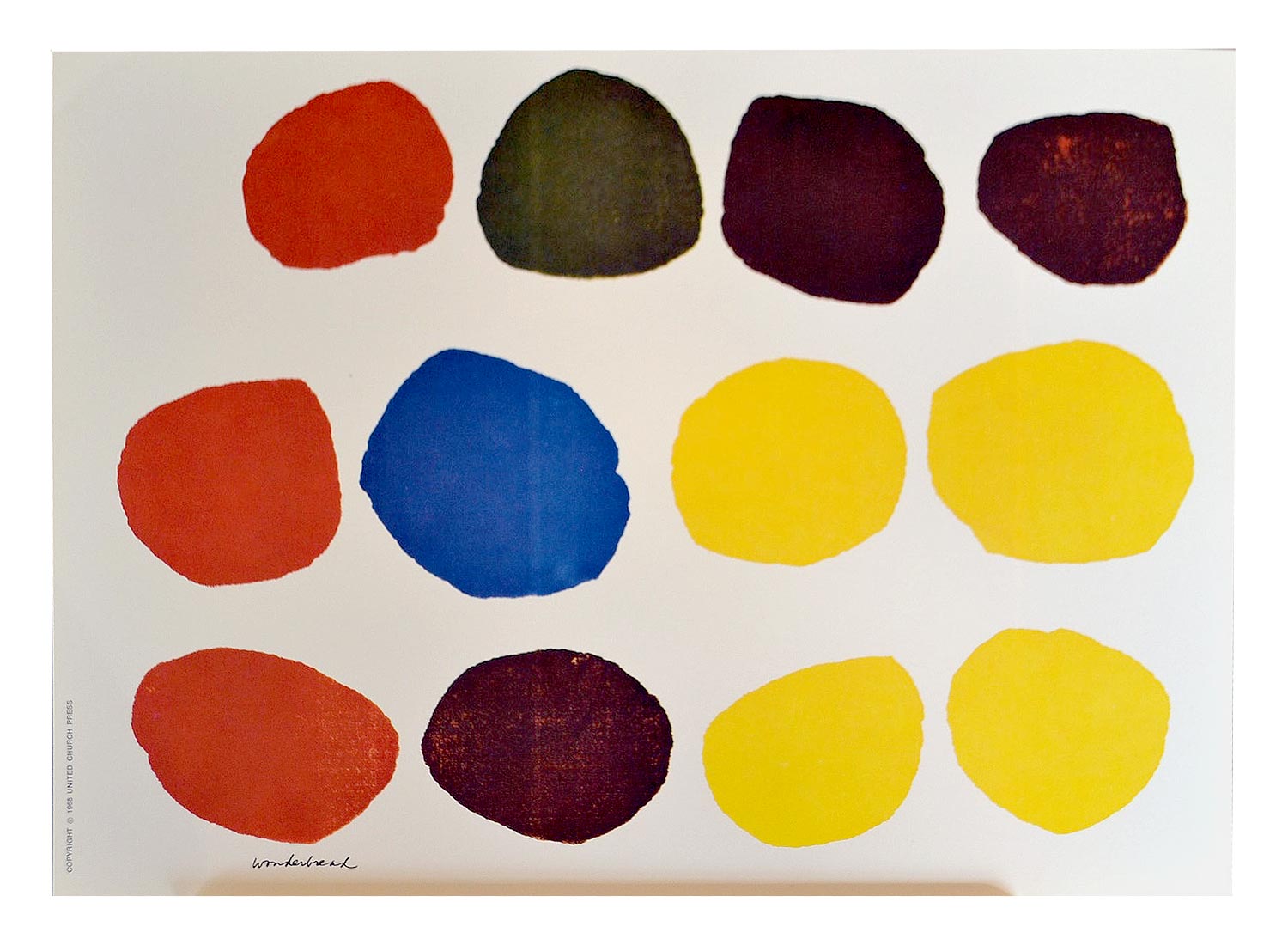
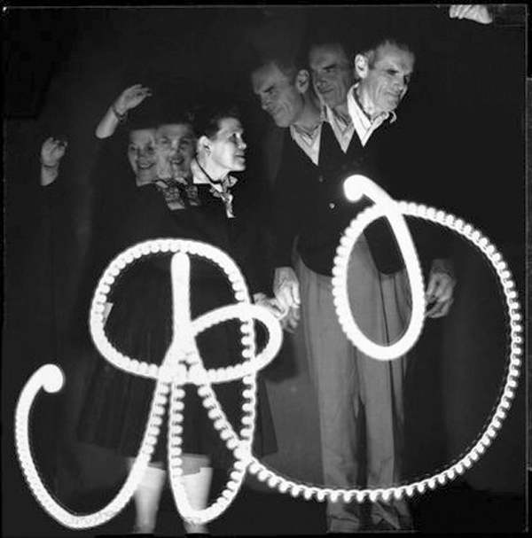
Corita Kent worked most substantially in prints, typically roughly assembled silkscreens. Her source material was found close by, including the neighborhood Safeway supermarket where for example she sourced the colored dots from a bag of Wonder Bread to make this transcendent print, Wonderbread (1968):
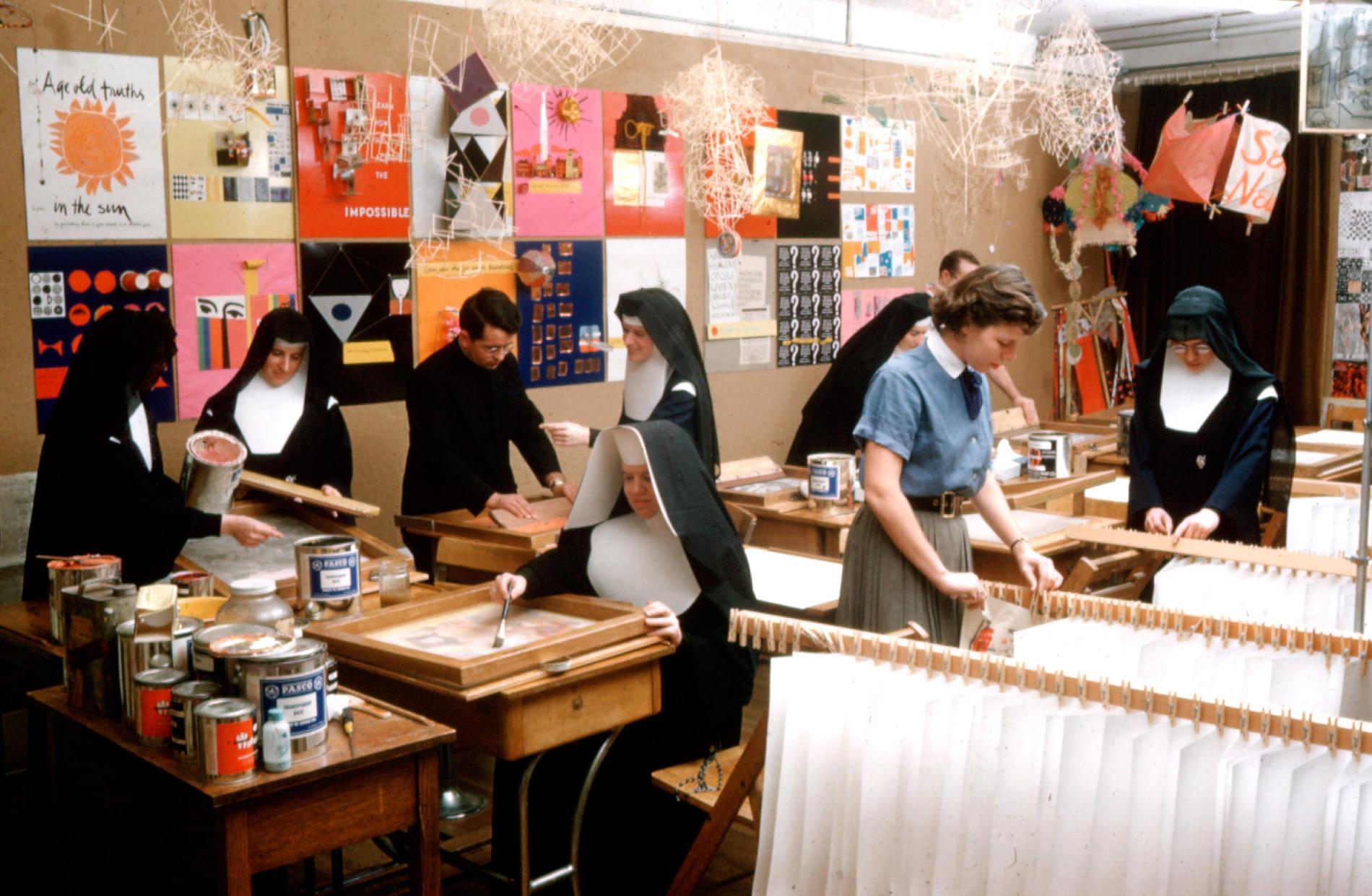
These were rough and ready prints, assembled from materials found close at hand. They were also excuses to work together, and to learn as a group. This picture captures something of that spirit:
Her and her students’ prints were vehicles for a particular flavor of spiritual messages which mixed a benevolent Catholic mysticism with reaching out to the secular world in all of its complexities. She described this medium in particular in how and what she hoped to accomplish:
As sometimes happens in such a comprehensive book project, Barbara became deeply involved with its subject matter. This is hardly surprising given the amount of time a book project like this takes. From the material, Barbara devised a talk delivered at Cooper Union in New York. We will watch that in class.
Continues in class . . .
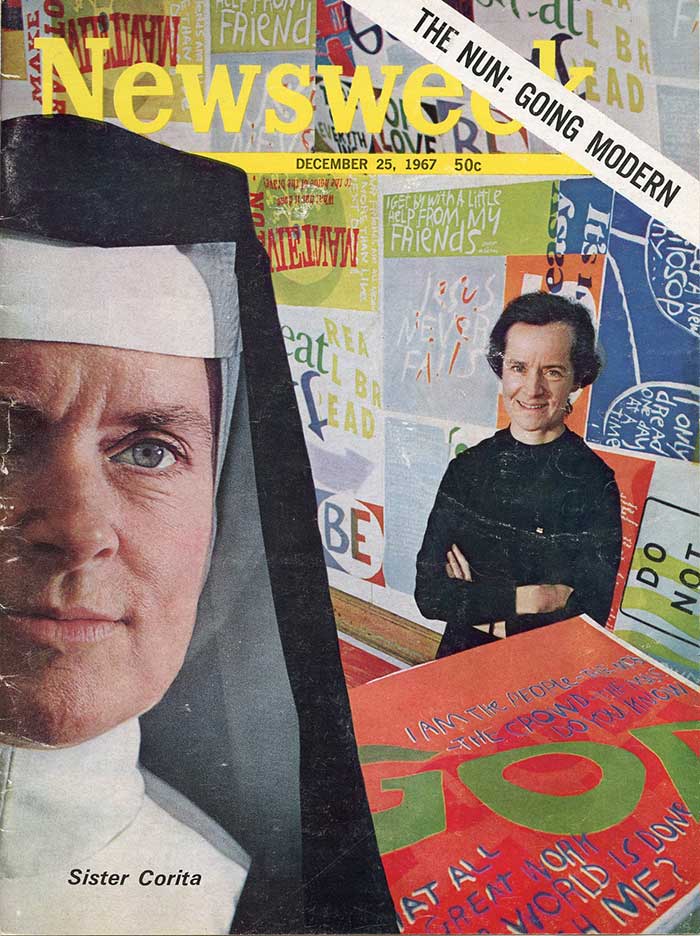
We have no art, we do everything as well as we can.Starting around 1938, Corita Kent lived in the community and taught at the private religious and art school in Los Angeles. Her classes continued until around 1968, by which time they attracted avante-garde artists and social activists from around the world including Charles and Ray Eames, Buckminster Fuller, John Cage, Alfred Hitchcock, and Saul Bass. By the time she left the College, she had appeared on the cover of Newsweek magazine:
Corita Kent was also already the subject of a 1967 documentary by Baylis Glascock, ”We Have No Art.” This film catches Kent at her lucid, modest, powerful best in the act of teaching. We are going to watch some choice excerpts from a 30-minute excerpt posted online.
Corita Kent worked most substantially in prints, typically roughly assembled silkscreens. Her source material was found close by, including the neighborhood Safeway supermarket where for example she sourced the colored dots from a bag of Wonder Bread to make this transcendent print, Wonderbread (1968):
These were rough and ready prints, assembled from materials found close at hand. They were also excuses to work together, and to learn as a group. This picture captures something of that spirit:
Her and her students’ prints were vehicles for a particular flavor of spiritual messages which mixed a benevolent Catholic mysticism with reaching out to the secular world in all of its complexities. She described this medium in particular in how and what she hoped to accomplish:
[printimaking] enables me to produce a quantity of original art for those who cannot afford to purchase high-priced art. … The distribution of these prints to everyday places of work pleases me, and I hope they will give people a lift.Corita Kent's work has been widely shown since. In the last few years there are at least two exhibitions which I would like you to have a look at. “Corita Kent and the Language of Pop” was initiated at the Harvard Art Museum in 2016 and tracks parallel streams in Kent's work and contemporary art of the time. “Someday is Now: The Art of Corita Kent” originated by the Frances Young Tang Teaching Museum and Art Gallery at Skidmore College looks like it was especially strong. That exhibition also produced an exceptional publication designed by Barbara Glauber, an independent graphic designer, writer, and teacher in New York.
As sometimes happens in such a comprehensive book project, Barbara became deeply involved with its subject matter. This is hardly surprising given the amount of time a book project like this takes. From the material, Barbara devised a talk delivered at Cooper Union in New York. We will watch that in class.
Continues in class . . .
February 24, 2026
It feels different this time.
Resources
“It is Time for Reparations.” (Nikole Hannah-Jones)
Black Lives Matter
Black Lives Matter on Library Stack
@justiceforgeorgenyc
Champions Design
Black Lives Matter, The Brand
New York Times Magazine masthead
Exercise
Nuclear Disarmament
Extinction Rebellion
ACT UP
MUSE
Recycling
Black Power
Doomsday Clock
Gay Pride
Earth Day
And so
Here (above) is a view from above.
Which, with its hand-painted and traffic-yellow-on-black type, by New York designer Bobby Martin immediately conjured the Brooklyn mural I had just seen. And it made me think more about the way that this urgent message was being carried, circulated, by a precise, robust, and defined graphic language. In the seven years that the movement has moved from a hashtag to global rally, this graphic language has also *evolved,* producing new forms and signatures as it has moved from place to place, circling the world, and penetrating the consciousness of millions, no billions, of people. Let's get back to the article—I will be reading about half of this today in class and you will be able to read the rest online.

Continues in class . . .
It feels different this time.In the June 28, 2020 issue of The New York Times Magazine Nikole Hannah-Jones continues.
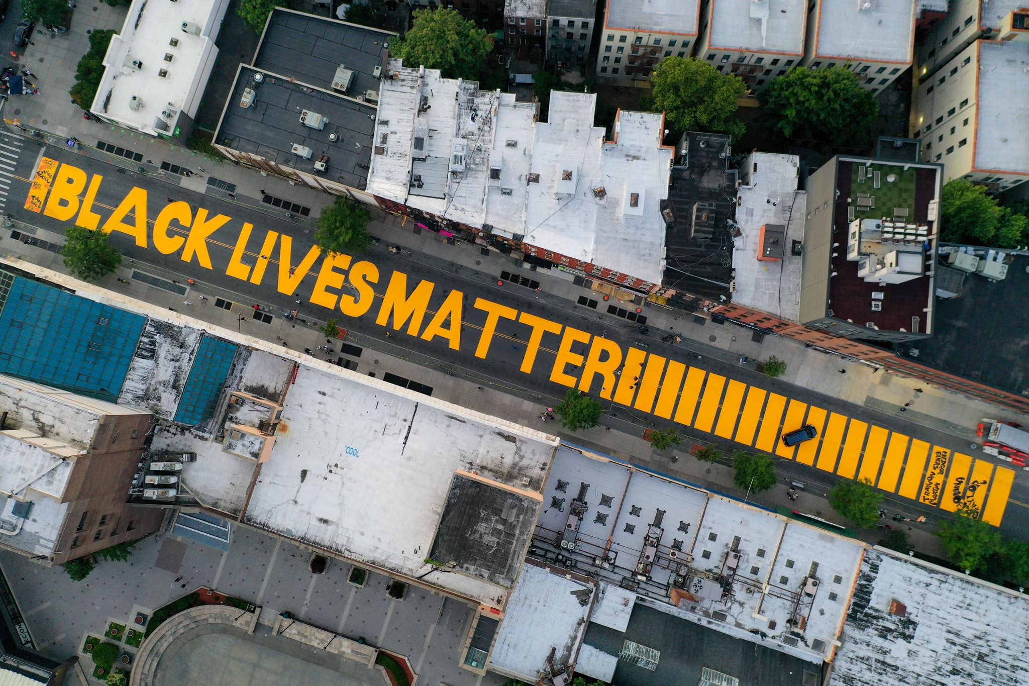
Black Americans protesting the violation of their rights are a defining tradition of this country. In the last century, there have been hundreds of uprisings in black communities in response to white violence. Some have produced substantive change. After the assassination of the Rev. Dr. Martin Luther King Jr. in 1968, uprisings in more than 100 cities broke the final congressional deadlock over whether it should be illegal to deny people housing simply because they descended from people who had been enslaved. The Fair Housing Act, which prohibits housing discrimination on the basis of race, gender and religion, among other categories, seemed destined to die in Congress as white Southerners were joined by many of their Northern counterparts who knew housing segregation was central to how Jim Crow was accomplished in the North. But just seven days after King’s death, President Lyndon B. Johnson signed the act into law from the smoldering capital, which was still under protection from the National Guard.This mural appeared on Fulton Street in the Bedford-Stuyvesant neighborhood of Brooklyn barely two weeks before the article was published. I took my then 14-year-old daughter before it was finished and it was deeply moving.
Here (above) is a view from above.
Most of the time these uprisings have produced hand-wringing and consternation but few necessary structural changes. After black uprisings swept the nation in the mid-1960s, Johnson created the Kerner Commission to examine their causes, and the report it issued in 1968 recommended a national effort to dismantle segregation and structural racism across American institutions. It was shelved by the president, like so many similar reports, and instead white Americans voted in a “law and order” president, Richard Nixon. The following decades brought increased police militarization, law-enforcement spending and mass incarceration of black Americans.
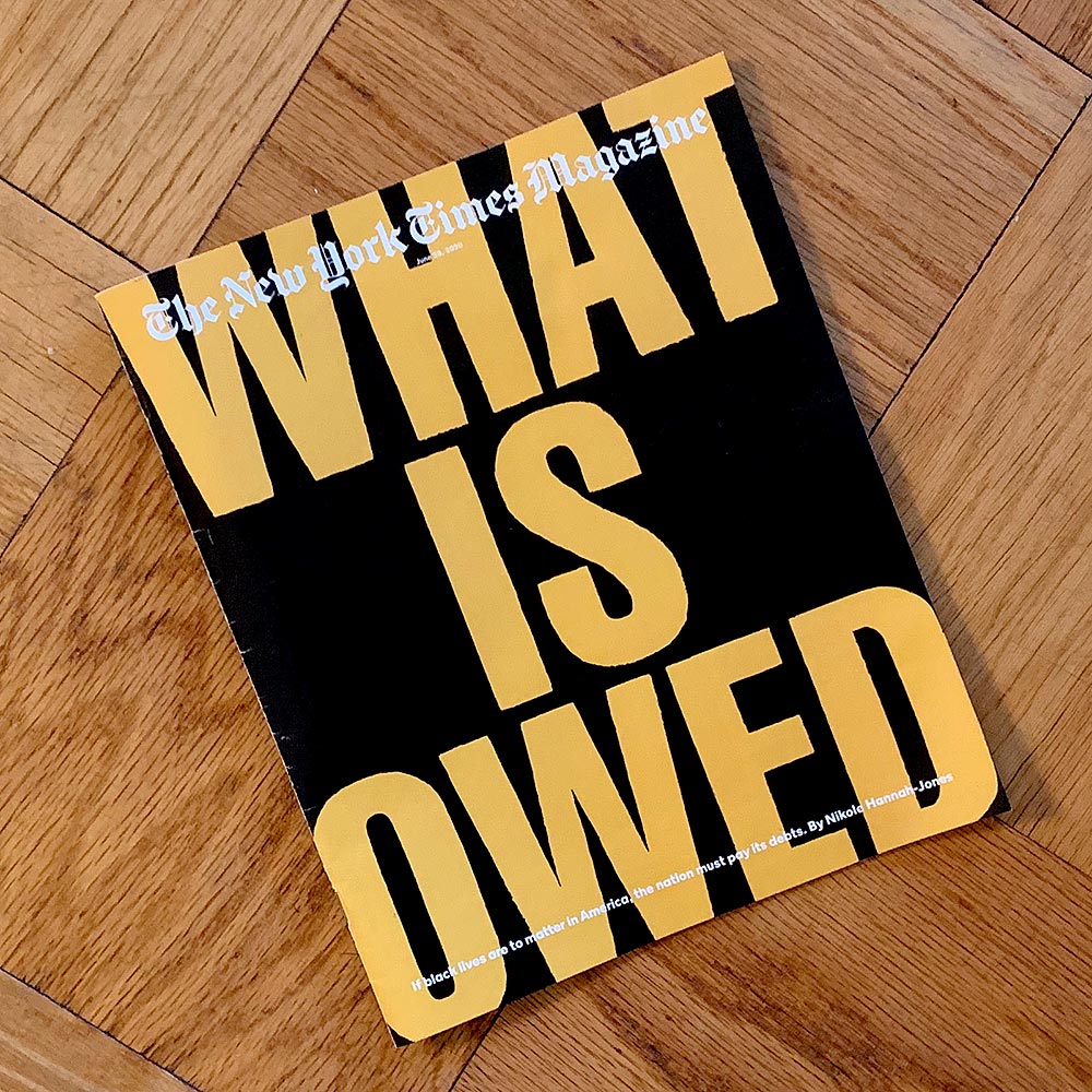
The changes we’re seeing today in some ways seem shockingly swift, and in other ways rage-inducingly slow. After years of black-led activism, protest and organizing, the weeks of protests since George Floyd’s killing have moved lawmakers to ban chokeholds by police officers, consider stripping law enforcement of the qualified immunity that has made it almost impossible to hold responsible officers who kill, and discuss moving significant parts of ballooning police budgets into funding for social services. Black Lives Matter, the group founded in 2013 by three black women, Patrisse Khan-Cullors, Alicia Garza and Opal Tometi, after the acquittal of Trayvon Martin’s killer, saw its support among American voters rise almost as much in the two weeks after Floyd’s killing than in the last two years. According to polling by Civiqs, more than 50 percent of registered voters now say they support the movement.“It is Time for Reparations.” That’s the clear, urgent article title when it appeared as the cover story with the following graphic:
Which, with its hand-painted and traffic-yellow-on-black type, by New York designer Bobby Martin immediately conjured the Brooklyn mural I had just seen. And it made me think more about the way that this urgent message was being carried, circulated, by a precise, robust, and defined graphic language. In the seven years that the movement has moved from a hashtag to global rally, this graphic language has also *evolved,* producing new forms and signatures as it has moved from place to place, circling the world, and penetrating the consciousness of millions, no billions, of people. Let's get back to the article—I will be reading about half of this today in class and you will be able to read the rest online.
The cascading effect of these protests has been something to behold. The commissioner of the N.F.L., which blackballed Colin Kaepernick for daring to respectfully protest police brutality, announced that the N.F.L. had, in fact, been wrong and that black lives actually do matter. (Kaepernick, on the other hand, still has no job.) HBO Max announced that it would temporarily pull from its roster the Lost Cause propaganda film “Gone With the Wind” — which in classically American fashion holds the spot as the highest-grossing feature film of all time. NASCAR came to the sudden realization that its decades-long permissiveness toward fans’ waving the battle flag of a traitorous would-be nation that fought to preserve the right to traffic black people was, in fact, contrary to its “commitment to providing a welcoming and inclusive environment for all fans, our competitors and our industry.” Bubba Wallace, the only full-time black driver at the sport’s top level, who had called on NASCAR to make the move, drove victory laps in an all-black stock car emblazoned with the words “#BLACKLIVESMATTER.”The resulting image is striking—literal circulation (and at full speed!) of the graphic hashtag as Bubba Wallace loops around the Martinsville speedway’s oval track.
Continues in class . . .
March 3, 2026
Black & White Television
Readings
A-Design-Miscellany.pdf (Paul Rand)
Resources
George Corrin Jr. 1922-2015
Production-Diary-of-the-Debates.pdf
A Paul Rand Interview with Steven Heller
we-have-no-art.zip (example)
Exercise
Printing
Assignment
#2 We have no art ...
Black & White Television
Readings
A-Design-Miscellany.pdf (Paul Rand)
Resources
George Corrin Jr. 1922-2015
Production-Diary-of-the-Debates.pdf
A Paul Rand Interview with Steven Heller
we-have-no-art.zip (example)
Exercise
Printing
Assignment
#2 We have no art ...
This is George Corrin. He practiced for 60 years as a set designer, a product designer, a graphic designer, and an exhibition designer. But he also almost didn’t do any of those things.
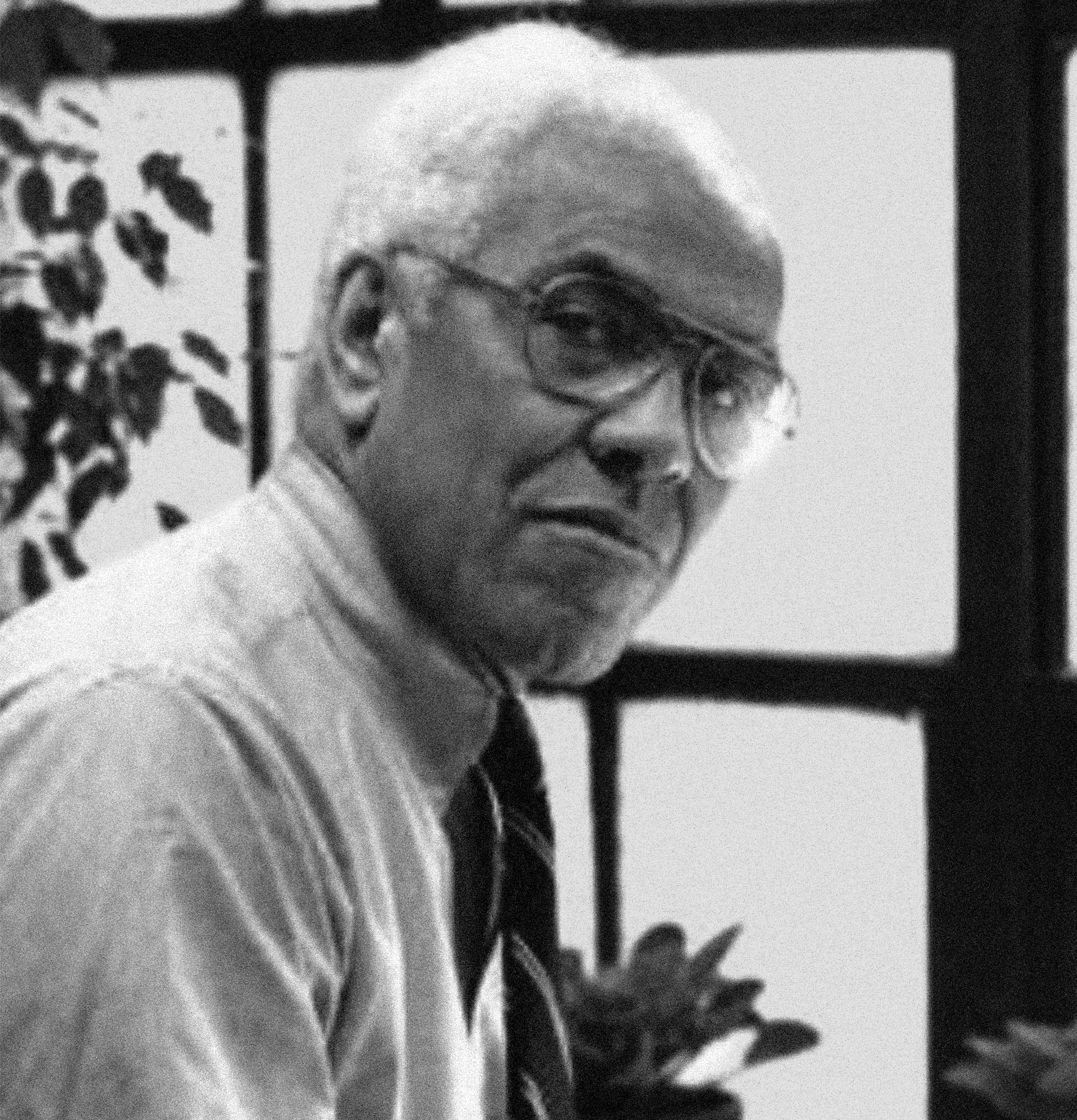
Applying to Carnegie Institute of Technology in 1942, Corrin was brushed off with a curt note from the dean saying,
In 1960, the presidential debates were to be televised, for the first time, with ABC, CBS, and NBC collaborating on four broadcasts. ABC hosted the third debate, but due to a scheduling conflict, it would be staged remotely with Senator John F. Kennedy in an ABC studio in New York and Vice President Richard M. Nixon on a set in Los Angeles. This was a live broadcast where—using the electronic medium of television and cross-country data links—the two candidates would appear to be in the same room. The set design was central to pulling off this illusion. Corrin was tasked with creating two identical sets which would also look convincing as a split-screen image.
Corrin continued to work with ABC for 13 years on sets, on-screen graphics, and various design projects. In 1962, the network invited an American graphic designer with an already large reputation to create a new logo

The designer was Paul Rand and here is a portrait from at least a few years before.
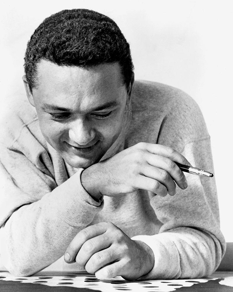
Peretz Rosenbaum was born in Brooklyn in 1914. Painting signs for his father’s grocery store led to studying design at Pratt Institute at night while attending public high school during the day for a more “practical” education. At Pratt, Rosenbaum assembled a portfolio of clean, modern design work and decided to modernize his name as well. Being Jewish, like being African American, at the time made working in design difficult. For all of its social rhetoric and its mostly liberal practitioners, the profession has a dreadful track record on diversity. Cloaking his Jewish identity, Rosenbaum took on the concise advertising-ready moniker made up from two sets of four letters: “Paul Rand.”
Continues in class . . .
Applying to Carnegie Institute of Technology in 1942, Corrin was brushed off with a curt note from the dean saying,
Negro students have not found the work of our department satisfactory to their needs ...and suggested that he apply instead to Fisk University, a historically African American school in Nashville, Tennessee. Corrin replied with a cascade of recommendation letters and the school reversed its decision, admitting him as its first African American student. He graduated Phi Beta Kappa from what would become Carnegie Mellon University and went on to study set design at Yale University School of Drama, receiving an MFA in 1951. After a brief tour of military duty in the South Pacific, Corrin landed a design job at ABC Television in New York. He was fascinated by the technical and social possibilities of television and how design could participate. He soon had the chance to manifest his interest.
In 1960, the presidential debates were to be televised, for the first time, with ABC, CBS, and NBC collaborating on four broadcasts. ABC hosted the third debate, but due to a scheduling conflict, it would be staged remotely with Senator John F. Kennedy in an ABC studio in New York and Vice President Richard M. Nixon on a set in Los Angeles. This was a live broadcast where—using the electronic medium of television and cross-country data links—the two candidates would appear to be in the same room. The set design was central to pulling off this illusion. Corrin was tasked with creating two identical sets which would also look convincing as a split-screen image.
Corrin continued to work with ABC for 13 years on sets, on-screen graphics, and various design projects. In 1962, the network invited an American graphic designer with an already large reputation to create a new logo
The designer was Paul Rand and here is a portrait from at least a few years before.
Peretz Rosenbaum was born in Brooklyn in 1914. Painting signs for his father’s grocery store led to studying design at Pratt Institute at night while attending public high school during the day for a more “practical” education. At Pratt, Rosenbaum assembled a portfolio of clean, modern design work and decided to modernize his name as well. Being Jewish, like being African American, at the time made working in design difficult. For all of its social rhetoric and its mostly liberal practitioners, the profession has a dreadful track record on diversity. Cloaking his Jewish identity, Rosenbaum took on the concise advertising-ready moniker made up from two sets of four letters: “Paul Rand.”
Continues in class . . .
March 17, 2026
Escape Velocity, or Interstellar Graphic Design
Readings
A-Million-Random-Digits.pdf (David Reinfurt)
Resources
Pioneer-Plaque.pdf (Linda Salzman Sagan)
NASA’s ‘Worm’ Logo Will Return to Space
Pioneer 10 plaque kickstarter
Pioneer Plaque (replica)
Pedestrian 24: A Space to Think
Studio Lab Training
Assignment
#3 The Pioneer Plaque
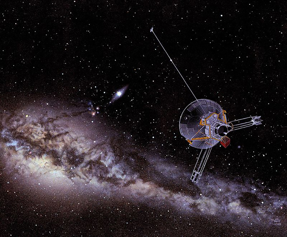
Pioneer 10 is (perhaps, was?) a space probe launched by NASA in 1972 pointed towards Jupiter. The first part of its mission was to photograph the surface from space and study its immediate environment, the asteroid belt, the solar wind, and cosmic rays. On successfully completing this first part of its mission, Pioneer 10 used its orbit around the giant planet to slingshot beyond it, becoming the first human-made object to achieve the escape velocity required to leave the Solar System.
Radio communications were lost January 23, 2003 when electric power for its transmitter stopped. The probe was then nearly 12 billion kilometers from Earth. It must be further now. Here’s an artist’s impression.
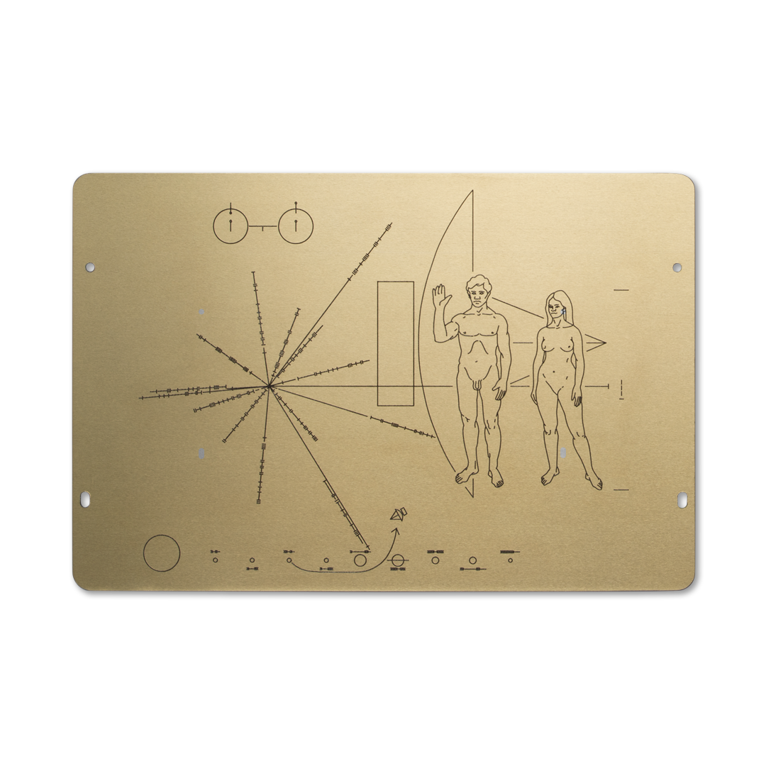
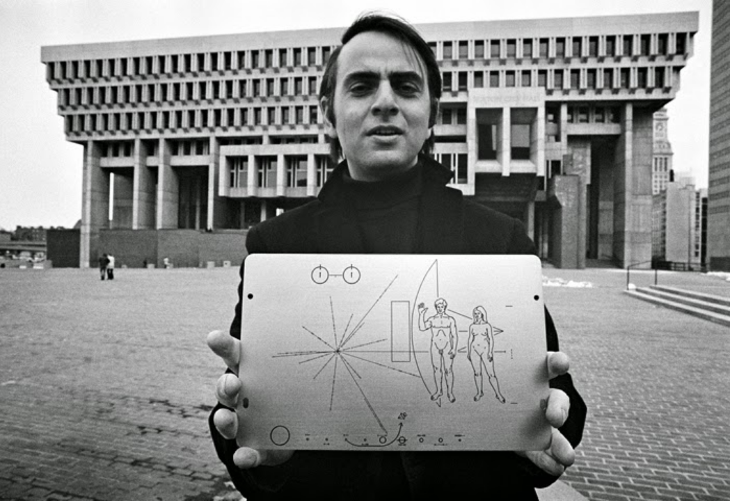
Pioneer 10 had another, slightly below-the-radar, mission which involved a single piece of precious cargo—one 6 × 9 inch gold-anodized aluminum plaque bolted onto the frame of the satellite. The plaque was the work of Carl Sagan, a Cornell astrophysicist, Linda Salzman Sagan, an artist, and Frank Drake, an astronomer who later instigated the Arecibo message.
The original idea for the plaque came from Eric Burgess, a British journalist visiting the Jet Propulsion Laboratory in Pasadena, California. After being briefed on the mission plan for Pioneer 10, he reasoned that if NASA was going to attempt to launch the first human-made object out of our solar system, then it was possible that the probe might eventually be found somewhere else, and perhaps by extraterrestrial life forms. He dreamed up a cosmic message-in-a-bottle which would carry fundamental information about humans on Earth for the plaque’s extra-solar recipients.
Sagan was already working around and lecturing on alien communication, and he was invited to head up the effort. He was relatively young, charismatic, and had an exceptional ability to communicate complex astrophysical ideas in a direct fashion.
He went on to co-write and narrate a multi-part public television series, Cosmos, which made a big impression on me in my youth. He is magnetic onscreen, portraying a cocktail of wonder and skepticism that he would later insist was the key to doing good science; if you have not seen it, you really ought to. Here he is unpacking the 4th dimension.
The Pioneer 10 plaque is a densely coded graphic object, consisting of at four primary zones of information. At the top to the left, is a drawing which conveys the transition of a Hydrogen atom. The time and distance implied provides a standard unit which becomes a key for reading measures in the other graphics. Below that is a misshapen asterisk which conveys where in the universe this plaque originated by identifying Earth's coordinates using radio pulsar distances. To the right of that is a drawing of two humans which is not anatomically correct. And along the bottom is diagram of our solar system showing the path on which the satellite left. It is almost impossibly dense, and perhaps that makes sense given its ambitions. This first piece of interstellar graphic design is likely somewhere at least 7.6 billion miles away by now.
Here is Carl Sagan around 1972 holding the completed Pioneer 10 plaque:
Continues in class . . .
Radio communications were lost January 23, 2003 when electric power for its transmitter stopped. The probe was then nearly 12 billion kilometers from Earth. It must be further now. Here’s an artist’s impression.
Pioneer 10 had another, slightly below-the-radar, mission which involved a single piece of precious cargo—one 6 × 9 inch gold-anodized aluminum plaque bolted onto the frame of the satellite. The plaque was the work of Carl Sagan, a Cornell astrophysicist, Linda Salzman Sagan, an artist, and Frank Drake, an astronomer who later instigated the Arecibo message.
The original idea for the plaque came from Eric Burgess, a British journalist visiting the Jet Propulsion Laboratory in Pasadena, California. After being briefed on the mission plan for Pioneer 10, he reasoned that if NASA was going to attempt to launch the first human-made object out of our solar system, then it was possible that the probe might eventually be found somewhere else, and perhaps by extraterrestrial life forms. He dreamed up a cosmic message-in-a-bottle which would carry fundamental information about humans on Earth for the plaque’s extra-solar recipients.
Sagan was already working around and lecturing on alien communication, and he was invited to head up the effort. He was relatively young, charismatic, and had an exceptional ability to communicate complex astrophysical ideas in a direct fashion.
He went on to co-write and narrate a multi-part public television series, Cosmos, which made a big impression on me in my youth. He is magnetic onscreen, portraying a cocktail of wonder and skepticism that he would later insist was the key to doing good science; if you have not seen it, you really ought to. Here he is unpacking the 4th dimension.
The Pioneer 10 plaque is a densely coded graphic object, consisting of at four primary zones of information. At the top to the left, is a drawing which conveys the transition of a Hydrogen atom. The time and distance implied provides a standard unit which becomes a key for reading measures in the other graphics. Below that is a misshapen asterisk which conveys where in the universe this plaque originated by identifying Earth's coordinates using radio pulsar distances. To the right of that is a drawing of two humans which is not anatomically correct. And along the bottom is diagram of our solar system showing the path on which the satellite left. It is almost impossibly dense, and perhaps that makes sense given its ambitions. This first piece of interstellar graphic design is likely somewhere at least 7.6 billion miles away by now.
Here is Carl Sagan around 1972 holding the completed Pioneer 10 plaque:
Continues in class . . .
March 24, 2026
A Happy Octopus
Readings
A-Happy-Octopus.pdf (Phyils and Philip Morrison)
Resources
Powers of Ten
Powers of Ten (A Rough Sketch for a Proposed Film)
Assignment
#3 The Pioneer Plaque
A Happy Octopus
Readings
A-Happy-Octopus.pdf (Phyils and Philip Morrison)
Resources
Powers of Ten
Powers of Ten (A Rough Sketch for a Proposed Film)
Assignment
#3 The Pioneer Plaque
The setting of any design, its wide context, lies around and underneath it; successful designers must know more than the work shows.This is Phylis and Philip Morrison writing about the work of Charles and Ray Eames. They should know, as the Morrisons collaborated with the Eames Office on a series of projects which married a deep understanding of scientific principles with inventive design to communicate complicated concepts to broad public audiences. Perhaps their best-known project together was the film Powers of Ten, which maybe you watched in elementary school. I did. But they also worked together on exhibition projects, curriculum projects, and other short films.
The Eames always knew more than was revealed in any one of their design projects. For example, when commissioned to design the National Fisheries Center and Aquarium, an expansive exhibition project on the Mall in Washington D.C, they set out to learn as much as possible about the subject including hosting a half-pint octopus in a tank in the office:
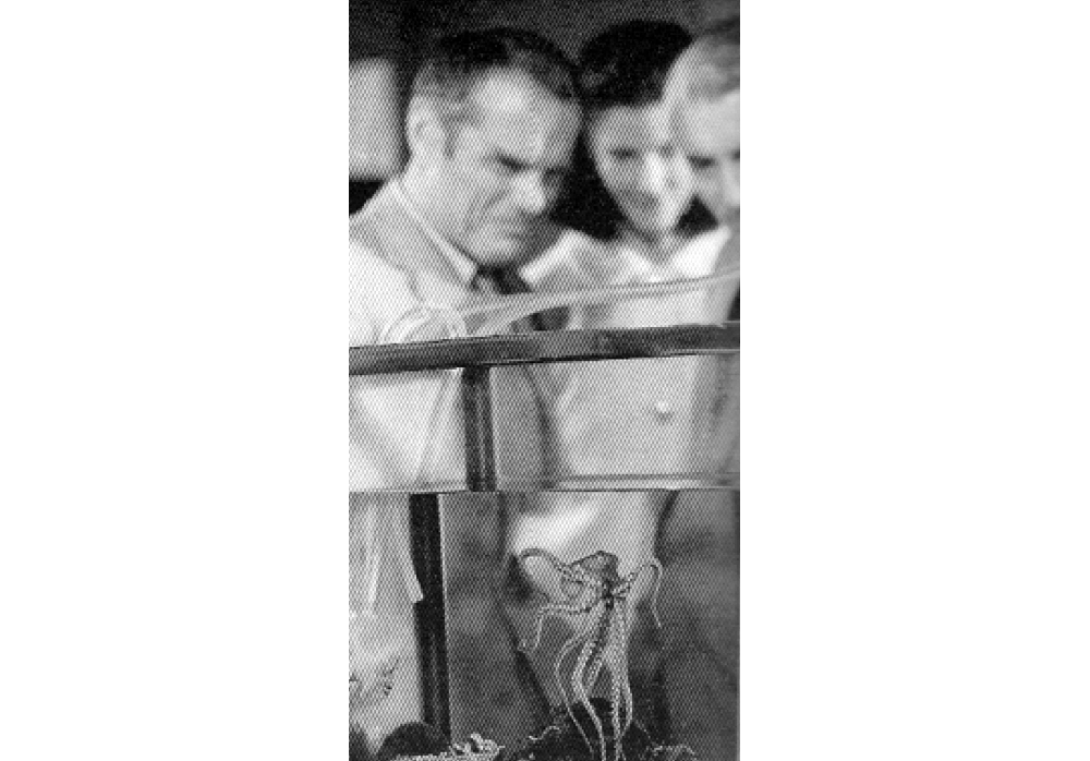
They treated the obligation so seriously, that this octopus became the longest-lived member of the species in captivity and would magically (it wasn’t really magic, but must have felt like it) change colors when staff members entered the room. If you have never seen an octopus do this, then you must. Here is a short video. You may not believe your eyes, but you should.
Charles and Ray met at Cranbrook Academy of Art in 1940. He was trained as an architect and she was a painter. They started to work together immediately and soon moved to Los Angeles, setting up a small design and research practice from their apartment. Their reputation grew and they accumulated employees and a vast design workshop in a disused industrial space at 901 Washington Avenue in Venice Beach. The Eames Office employed designers of all stripes including architects, industrial, and graphic designers, but also editors, producers, and model makers.
The Eames’ design approach has often been described as playful. And that is fair enough. That play was also carefully staged and, I imagine, this loose approach is what kept the work so inventive for so many years. Here is a publicity portrait of Charles and Ray where it seems they have been pinned by the octopus-like metal bases of a chair they had (at the time) recently designed for Herman Miller:
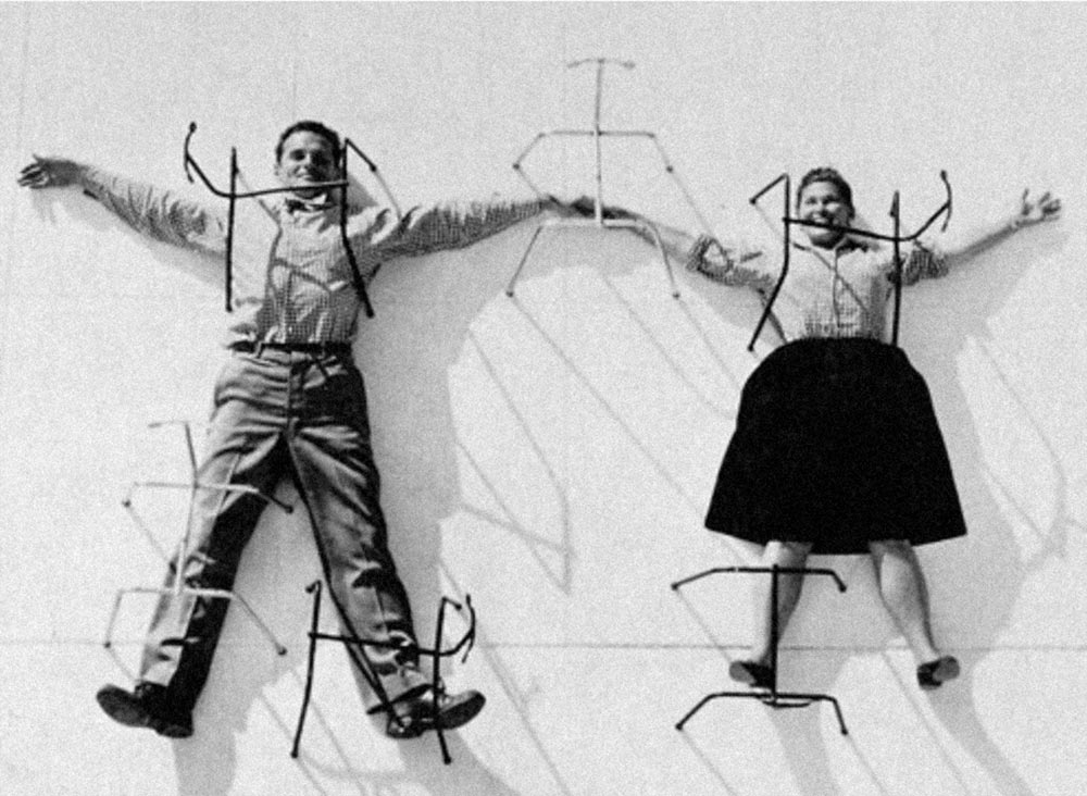
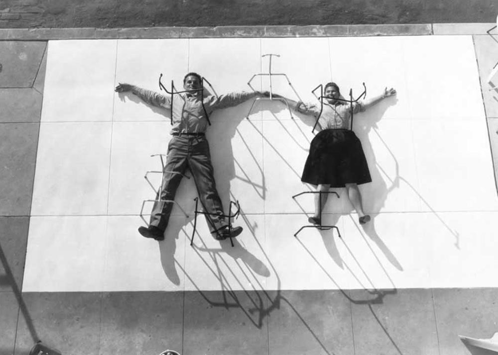
You can see in this making-of photograph how the final image was made. It simply looks loose and certainly fun. As much play as it is calculated production. I’ve seen this image in exhibitions of their work but I don’t know how or if it was used when it was made. But that hardly matters.
Continues in class . . .
March 31, 2026
A Live Archive
Readings
The-Cobweb.pdf (Jill Lepore)
Resources
Black Lives Matter posters on The Internet Archive
The Wayback Machine
Just another WordPress Site
Assignment
#3 The Pioneer Plaque
Remember
Class meets today at StudioLab!
A Live Archive
Readings
The-Cobweb.pdf (Jill Lepore)
Resources
Black Lives Matter posters on The Internet Archive
The Wayback Machine
Just another WordPress Site
Assignment
#3 The Pioneer Plaque
Remember
Class meets today at StudioLab!
Brewster Kahle founded The Internet Archive in his San Francisco attic in 1996. By 2009, the project needed more space.
He tracked down a real estate listing on Funston Street in the outer Richmond and went to visit. The defunct Christian Science church made immediate sense. Kahle describes,

The Archive moved into a new home where it currently contains (at last count according to Wikipedia) over 20 million books, 3 million videos, 400,000 software programs, 7 million audio files, and 400 billion web pages. Webpages are collected and accessed through The Wayback Machine, which is a kind of Google-plus allowing a user to not only search a specific website *now* but also to access *previous* versions. It is an impossible and surely Sissyphian task, however The Internet Archive crawls the ever-changing world wide web making backups of the digital material it collects en route. Much of this data lives physically in the former church on custom-designed storage clusters called Petabox.
This all reminds me of the story about painting the Golden Gate Bridge (the entrance to which is not far from The Internet Archive). Because the Golden Gate has such intense fog and weather, repainting the bridge is a continuous task. When a painting crew has reached the far side, they start again moving in the opposite direction. Painting the Golden Gate its distinctive International Orange is a never-ending job.
This story sounds apocryphal, but a quick Google search confirms.

Anyway, what the Internet Archive does is, in fact, impossible. The internet is massive and constantly changing. Any attempt to collect a complete picture of it, like completely repainting the Golden Gate bridge, is not possible at any one time. However, a partial picture is still massively valuable. Brewster Kahle describes what he imagines like this:
Continues in class . . .
He tracked down a real estate listing on Funston Street in the outer Richmond and went to visit. The defunct Christian Science church made immediate sense. Kahle describes,
We bought this building because it matched our logo.
The Archive moved into a new home where it currently contains (at last count according to Wikipedia) over 20 million books, 3 million videos, 400,000 software programs, 7 million audio files, and 400 billion web pages. Webpages are collected and accessed through The Wayback Machine, which is a kind of Google-plus allowing a user to not only search a specific website *now* but also to access *previous* versions. It is an impossible and surely Sissyphian task, however The Internet Archive crawls the ever-changing world wide web making backups of the digital material it collects en route. Much of this data lives physically in the former church on custom-designed storage clusters called Petabox.
This all reminds me of the story about painting the Golden Gate Bridge (the entrance to which is not far from The Internet Archive). Because the Golden Gate has such intense fog and weather, repainting the bridge is a continuous task. When a painting crew has reached the far side, they start again moving in the opposite direction. Painting the Golden Gate its distinctive International Orange is a never-ending job.
This story sounds apocryphal, but a quick Google search confirms.
Anyway, what the Internet Archive does is, in fact, impossible. The internet is massive and constantly changing. Any attempt to collect a complete picture of it, like completely repainting the Golden Gate bridge, is not possible at any one time. However, a partial picture is still massively valuable. Brewster Kahle describes what he imagines like this:
The idea was to try to build the Library of Alexandria, version two.The Library of Alexandria was burned and much of the written material of the ancient Mediterranean world was lost forever. The Internet Archive was conceived to avoid this fate and has more than 40 petabytes of digital data stored across redundant data centers on what amounts to simply a lot of hard drives.
Continues in class . . .
April 7, 2026
Recycled Materials (Black Dada)
Readings
The-Ecstasy-of-Influence.pdf
Resources
Racial Caste in America (Behind the Cover)
On the Black Dada Reader
Martin Luther King’s Powerful Speeches, Captured In a Typeface
Adam Pendleton studio website
Assignment
#3 The Pioneer Plaque
Recycled Materials (Black Dada)
Readings
The-Ecstasy-of-Influence.pdf
Resources
Racial Caste in America (Behind the Cover)
On the Black Dada Reader
Martin Luther King’s Powerful Speeches, Captured In a Typeface
Adam Pendleton studio website
Assignment
#3 The Pioneer Plaque
Artist Adam Pendleton works with recycled materials. For example, this recent cover for the July 2, 2020 issue of The New York Times Magazine:
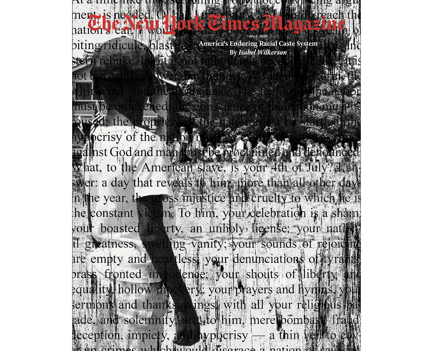
uses a 60-year old photograph of a young boy watching a group of people, some carrying American flags, march past to protest the admission of the “Little Rock Nine” to Central High School in Little Rock, Arkansas on August 20, 1959.
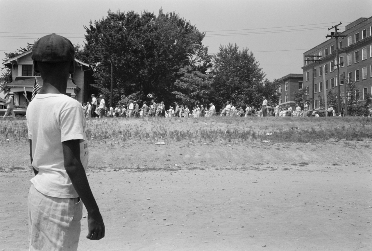
It‘s an extraordinarily powerful image. But then he’s layered the image, as he often does, with a text fragment. In this case it is an excerpt from an 1852 speech by Frederick Douglas, What to the American Slave is the Fourth of July. The image was cropped and both the photograph and the typeset text were then photocopied, or scanned, and otherwise marked by Adam. Productive noise was added and the recycled materials appear “handled” according to Times Magazine design director Gail Bichler.
The impossible collapse of times in the misregistered collage is typical of Adam's work and the reason why I wanted to introduce him in class. He takes existing materials, modifies them, and then puts them back in circulation where they carry both the original meaning as well as a time-shifted one.
I happend to see a show Adam made in New Orleans in 2016 called “Becoming Imperceptible.” It was at the Contemporary Arts Center. It was a great exhibition, but what I particularly remember is an all-over installation on the walls, and nooks and crannies, of the main floor of the museum. I’m sure I remember it in particular as I performed in front of it that night. (This is another story.) Anyway, it looked like this.
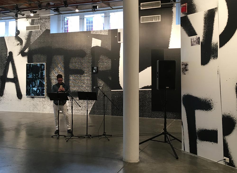
Looking at it now I am struck by the repeated Black Lives Matter text spray painted, repeated and fractured throughout. I suppose I am curious what the source is for this particular typography as when looking at a more recent project of Adam’s, Black Dada Flag (Black Lives Matter), I see the same typography recycled. The flag flew on the tip of Randall’s Island during the 2018 Frieze art fair in New York.
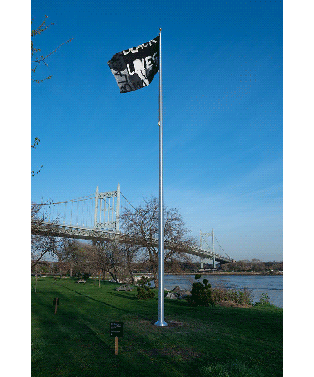
Anyway, it looks the same. Or similar enough to make me stop and think about how these graphics move around.
Continues in class . . .
uses a 60-year old photograph of a young boy watching a group of people, some carrying American flags, march past to protest the admission of the “Little Rock Nine” to Central High School in Little Rock, Arkansas on August 20, 1959.
It‘s an extraordinarily powerful image. But then he’s layered the image, as he often does, with a text fragment. In this case it is an excerpt from an 1852 speech by Frederick Douglas, What to the American Slave is the Fourth of July. The image was cropped and both the photograph and the typeset text were then photocopied, or scanned, and otherwise marked by Adam. Productive noise was added and the recycled materials appear “handled” according to Times Magazine design director Gail Bichler.
The impossible collapse of times in the misregistered collage is typical of Adam's work and the reason why I wanted to introduce him in class. He takes existing materials, modifies them, and then puts them back in circulation where they carry both the original meaning as well as a time-shifted one.
I happend to see a show Adam made in New Orleans in 2016 called “Becoming Imperceptible.” It was at the Contemporary Arts Center. It was a great exhibition, but what I particularly remember is an all-over installation on the walls, and nooks and crannies, of the main floor of the museum. I’m sure I remember it in particular as I performed in front of it that night. (This is another story.) Anyway, it looked like this.
Looking at it now I am struck by the repeated Black Lives Matter text spray painted, repeated and fractured throughout. I suppose I am curious what the source is for this particular typography as when looking at a more recent project of Adam’s, Black Dada Flag (Black Lives Matter), I see the same typography recycled. The flag flew on the tip of Randall’s Island during the 2018 Frieze art fair in New York.
Anyway, it looks the same. Or similar enough to make me stop and think about how these graphics move around.
Continues in class . . .
April 14, 2026
Elliptical Thinking
Readings
Elliptical-Thinking.pdf (David Reinfurt)
Resources
The-Life-and-Death-of-Media.pdf (Bruce Sterling)
Borromini's San Carlo alle Quattro Fontane (Cameron Wu)
Assignment
#1 The Information
Elliptical Thinking
Readings
Elliptical-Thinking.pdf (David Reinfurt)
Resources
The-Life-and-Death-of-Media.pdf (Bruce Sterling)
Borromini's San Carlo alle Quattro Fontane (Cameron Wu)
Assignment
#1 The Information
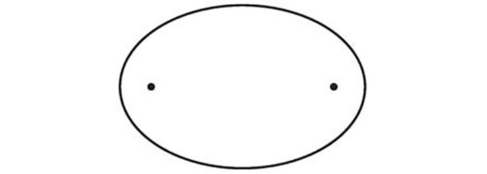
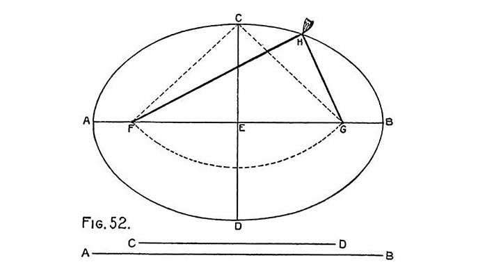
The circle is a special case: it has only one center. It’s the collection of all points that stand at exactly the same distance from that center (or more precisely, “focus”). This common distance is called the radius and it determines the circle’s overall size.

But I’m different: I have TWO so-called centers. These aren’t really at my center either, but rather spread a bit. My shape is defined as all the points whose *combined* distance from the two foci is constant. The line that runs from one side of me to the other and passes through both foci is called the major axis. A second line that cuts me in half, running from top to bottom at a right angle to the first one is called the minor axis. In a circle, the major and minor axis are the same, but in an ellipse, like me, they are different and that difference determines my overall shape, from long and skinny to short and plump. The ratio between the two axes is the ellipse’s *eccentricity.* As you can see in the self-portrait below, I’m not really that eccentric.
The Greeks (well, Apollonius of Perga in 3 B.C.) named me after the ellipsis, a composite typographic glyph composed of three full stops, one after the other which identifies an ommission. “Ellipse” was coined in Apollonius’ Conics, where Book 1, Postulate 13 defines the ellipse as a conic section (a slice) that “falls short.” We’ll come back to conic sections, but for now, just keep in mind that a circle is always an ellipse, but an ellipse is rarely a circle.
Then there’s the oval. It’s quite common—you find these all over. The oval is a closed form, continuously curved with two axes of symmetry. This just means you can fold an oval evenly in half two ways, across two different lines that are perpendicular to each other. Many, many shapes are ovals, but only a select few qualify as ellipses.
People have known about ellipses for a long time, at least since Euclid wrote his book on geometry in the 4th century B.C. Take a circle, stretch it in any one direction and you’ll find me. There’s also a very straightforward (and enjoyable) way to construct an ellipse. You’ll need two push pins, a pencil and a length of string. Take the two pins, stick them in the paper any distance apart. Connect the pins with a string loop larger than the distance between the two. Then just put your pencil in the loop, and stretch it tight to make the third point of a triangle. Just rotate the pencil around the two pins keeping the string tight and the resulting shape your pencil draws is an ellipse.
Continues in class . . .
But I’m different: I have TWO so-called centers. These aren’t really at my center either, but rather spread a bit. My shape is defined as all the points whose *combined* distance from the two foci is constant. The line that runs from one side of me to the other and passes through both foci is called the major axis. A second line that cuts me in half, running from top to bottom at a right angle to the first one is called the minor axis. In a circle, the major and minor axis are the same, but in an ellipse, like me, they are different and that difference determines my overall shape, from long and skinny to short and plump. The ratio between the two axes is the ellipse’s *eccentricity.* As you can see in the self-portrait below, I’m not really that eccentric.
The Greeks (well, Apollonius of Perga in 3 B.C.) named me after the ellipsis, a composite typographic glyph composed of three full stops, one after the other which identifies an ommission. “Ellipse” was coined in Apollonius’ Conics, where Book 1, Postulate 13 defines the ellipse as a conic section (a slice) that “falls short.” We’ll come back to conic sections, but for now, just keep in mind that a circle is always an ellipse, but an ellipse is rarely a circle.
Then there’s the oval. It’s quite common—you find these all over. The oval is a closed form, continuously curved with two axes of symmetry. This just means you can fold an oval evenly in half two ways, across two different lines that are perpendicular to each other. Many, many shapes are ovals, but only a select few qualify as ellipses.
People have known about ellipses for a long time, at least since Euclid wrote his book on geometry in the 4th century B.C. Take a circle, stretch it in any one direction and you’ll find me. There’s also a very straightforward (and enjoyable) way to construct an ellipse. You’ll need two push pins, a pencil and a length of string. Take the two pins, stick them in the paper any distance apart. Connect the pins with a string loop larger than the distance between the two. Then just put your pencil in the loop, and stretch it tight to make the third point of a triangle. Just rotate the pencil around the two pins keeping the string tight and the resulting shape your pencil draws is an ellipse.
String construction of an ellipse from Radford’s Cyclopedia of Construction (1909)This is maybe the most obvious way to construct an ellipse, but clearly not the only one, and many constructions are known and used. The first properly formalized construction was published and circulated in Germany at the beginning of the 16th century. Unterweisung der Messung mit dem Zirkel un Rischtscheyt, or Course in the Art of Measurement with Compass and Ruler is a set of four books written, illustrated, and published by Albrecht Dürer in 1525. Each book collects existing knowledge and Dürer’s own insights around geometry, i.e. the study of shapes like me.
Continues in class . . .
April 21, 2026
Will Holder speaks in circles
Readings
Liner notes for a class talk (Will Holder)
Resources
uh books
F.R.David
All Collected Voices
Yale Union
Kunstwerke: A Year With Will Holder
Assignment
#3 The Pioneer Plaque
Will Holder speaks in circles
Readings
Liner notes for a class talk (Will Holder)
Resources
uh books
F.R.David
All Collected Voices
Yale Union
Kunstwerke: A Year With Will Holder
Assignment
#3 The Pioneer Plaque
Will Holder speaks in circles. These are often, well mostly, other people’s words. He selects them, edits them, gives them form (often a context, also), he publishes them (for example in F.R. David, the journal he produced for nearly 20 years), he performs them, and then he lets go, setting the words in motion to move around on their own momentum. Will sent along some in a cheat sheet / liner notes for this Tuesday’s class. Please read. And here are a few borrowed from Robert Ashley:

The graph is read circularly. Each dot represents a constant unit of time that is determined privately by each performer. This unit should be a natural pulse that does not tend to subdivide in the performer’s mind. The individual performer assigns to each quadrant of the score one of the following sound elements: pitch; intensity; timbre [tonal color changes effected through the use of mutes, filters, bow movement, etc.]; density [the mixing of tonal in gredients, as in: flutter-tongue, double-stops, mixed vocal and instrumental sound, etc.]*. These sound elements may be assigned to the quadrants in any pattern, and that pattern—while it will “revolve” in its relationship to the score—will remain constant. (in the relationship of its parts) throughout the performance. The ensemble should prepare a sonority within which the individual instruments are not distinguishable. This sonority will provide, for the individual performers, a tonal reference for the various sound activities that constitute the performance. Whenever any performer is playing his contribution to the reference sonority, time (duration) is unmeasured (free) for him. Whenever any performer is playing through the (sixteen) measured pulses of a quadrant, he must deviate continuously, but as gradually as possible, from his contribution to the reference sonority.
The performance begins with the reference sonority. At any time, then, individual performers may play through any (starting) quadrant. Subsequently, they will continue reading circularly, alternating unmeasured periods of their contribution to the reference sonority with measured periods of assigned deviations.
Whenever any performer first becomes aware of a deviant element (other than his own) in the reference sonority, his pattern of assigned sound elements (quadrants) shifts circularly so that the mode of deviation he recognizes is assigned to the quadrant opposite that in which he is playing or will play next. (As the pattern of quadrants remains constant, thus, all quadrants will be redesignated.) The pattern of quadrant designations remains in its changed position until the performer has played through the succeeding (newly designated) quadrant, after which it is subject again to transposition through the appearance of deviant elements in the sonority.
(Robert Ashley, …in memoriam Esteban Gomez (quartet) instructions, 1967)
Continues in class . . .
April 28, 2026
Didactic Distorted
Resources
Distorted Didactic posters
Assignment
#1 The Information
#2 We have no art . . .
#3 The Pioneer Plaque
Didactic Distorted
Resources
Distorted Didactic posters
Assignment
#1 The Information
#2 We have no art . . .
#3 The Pioneer Plaque
We got busy immediately, installing plaques and posters with a laser level, finding saw horses, and assembling an ad hoc table for the books:
Collecting texts from everyone, writing some new texts, typesetting, (proofreading?), editing, and designing an exhibition booklet:
Naming the show, giving it a visual vocabulary, and designing a poster (well several different posters):
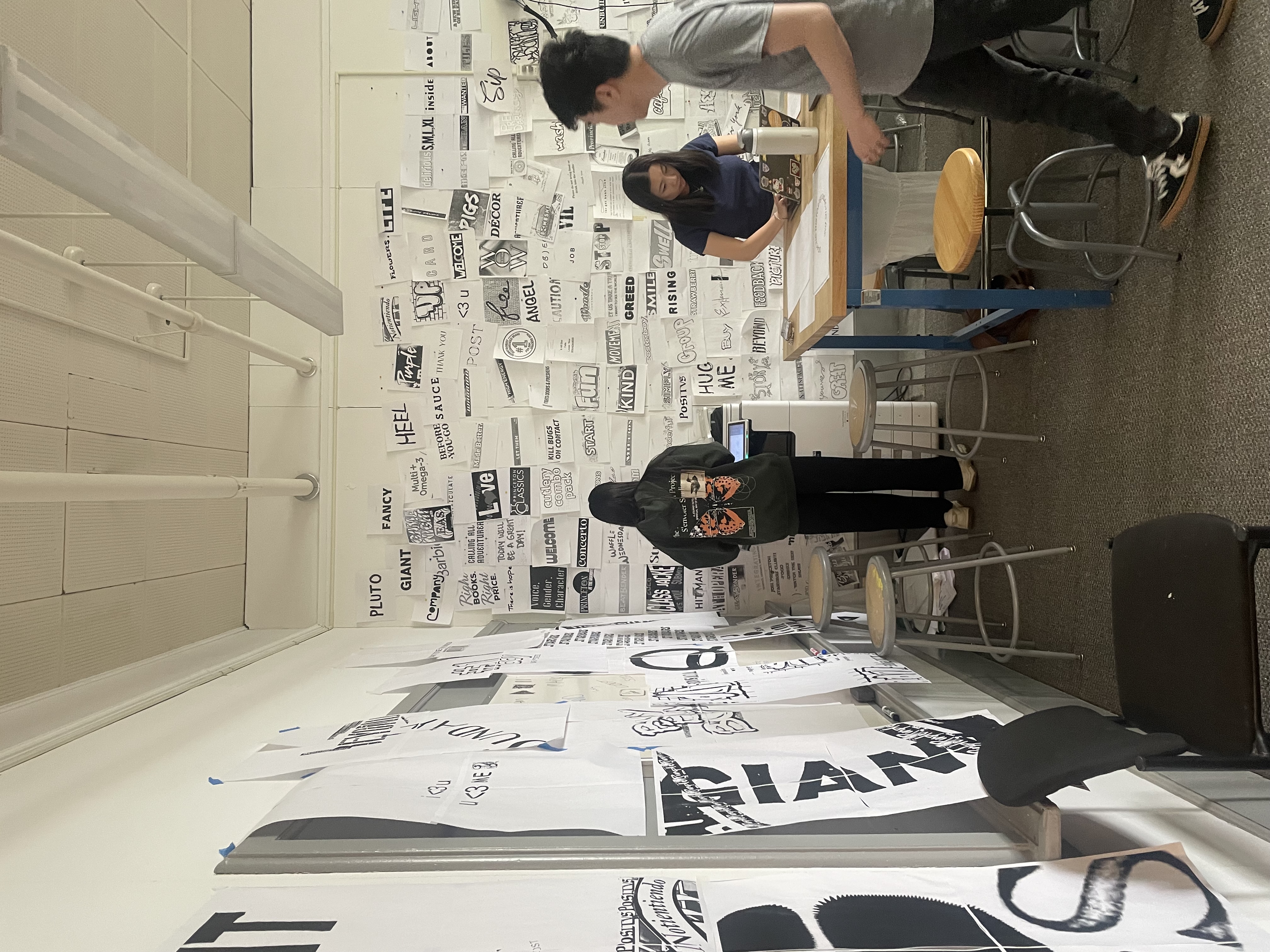
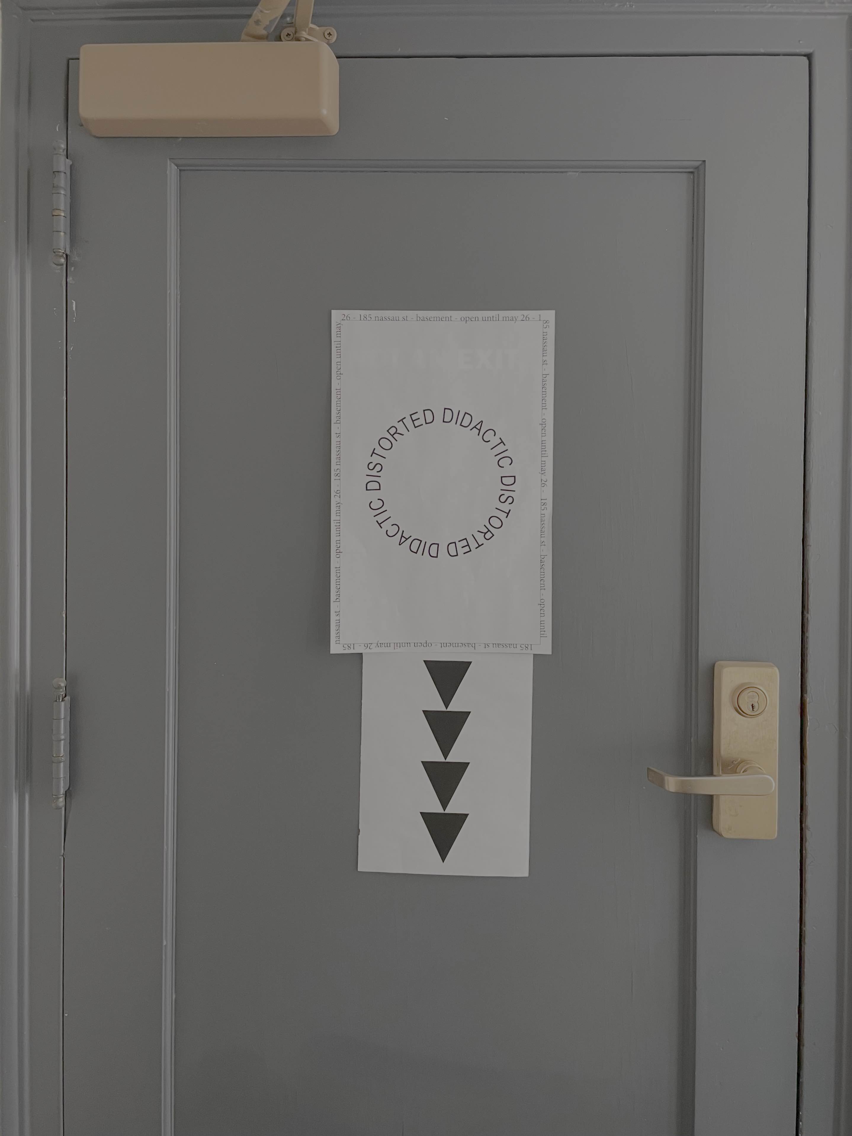
Didactic Distorted was conceived, produced, and installed in less than three hours through the collective work of all 11 of you working together. The exhibition assembles class work over the course of the semester in a small basement gallery space at 185 Nassau, conveniently located behind a door tucked under a staircase previously marked NOT AN EXIT and now signed by an exhibition poster and directional arrow, down a flight of stairs, through another door, and down a small hallway. The show includes book covers (Assignment #1), posters (Assignment #2), and interstellar space plaques (Assignment #3). It is remarkably dense, rather abstract, and assertively black and white. It looks fantastic.
But your work cannot be contained by this basement gallery space. These graphics are meant to circulate, whether (hypothetically) as alternate book covers for The Information, as posters that collect found and Turbo-scanned language fragments, or on space plaques bound for interstellar, extra-terrestrial recipients. In fact, even the posters you designed for this show have escaped the basement and are out there, across campus on bulletin boards and less-authorized locations, doing their mostly-silent work of announcing this exhibition and possibly motivating a curious reader to visit.
Didactic Distorted is now *open* and will remain so for one month:
Collecting texts from everyone, writing some new texts, typesetting, (proofreading?), editing, and designing an exhibition booklet:
Naming the show, giving it a visual vocabulary, and designing a poster (well several different posters):
Didactic Distorted was conceived, produced, and installed in less than three hours through the collective work of all 11 of you working together. The exhibition assembles class work over the course of the semester in a small basement gallery space at 185 Nassau, conveniently located behind a door tucked under a staircase previously marked NOT AN EXIT and now signed by an exhibition poster and directional arrow, down a flight of stairs, through another door, and down a small hallway. The show includes book covers (Assignment #1), posters (Assignment #2), and interstellar space plaques (Assignment #3). It is remarkably dense, rather abstract, and assertively black and white. It looks fantastic.
But your work cannot be contained by this basement gallery space. These graphics are meant to circulate, whether (hypothetically) as alternate book covers for The Information, as posters that collect found and Turbo-scanned language fragments, or on space plaques bound for interstellar, extra-terrestrial recipients. In fact, even the posters you designed for this show have escaped the basement and are out there, across campus on bulletin boards and less-authorized locations, doing their mostly-silent work of announcing this exhibition and possibly motivating a curious reader to visit.
Didactic Distorted is now *open* and will remain so for one month:
April 28 – May 25, 2026Continues elsewhere . . .